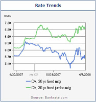
Bilateral graphs depict two or more variables. They show this in much the same way as a bar graph or line graphs.
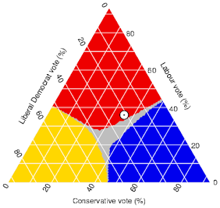
Triangular plots depict the way three variables interact with eachother. This is often used in geology as a way to show the way three different types of rocks can combine. The map to the right shows the ways in which political demographics were split
Climographs show the average monthly amounts of precipitation and correlating temperatures. This map of Hawaii shows and average temperature of around 70-80 degrees year round while precipitation changes with seasons
Windrose incorporate a rose compass overlain with the direction and power of winds. This is used most often by meteorologists to predict and study weather.
Parralel coordinate graphs are perhaps the most difficult and complex graphs within this catalogue. Parralel graphs depict multivariabled data, with each point having its own y/x axis with lines connection each observation between variables.
Population profiles show the change in population by age. This is done through the use of a census.
In this profile you can see that while there is a greater number of younger males then females, females outnumber males later in life.Scatterplots show correlating data by the placement of dots. This map shows the correlation of the ages of wife and husband.
Subscribe to:
Comments (Atom)


